
Slide-overs
Open forms in a side panel of the admin panel, like the brand and attribute forms of Shopper.
The admin panel opens most short forms in a panel that slides in from the side of the screen: brands, attributes, shipping options and team members, among others. Each panel is a Livewire component that extends Laravelcm\LivewireSlideOvers\SlideOverComponent, and the admin layout renders the panels that are open. Your own panels work the same way, with a form inside.
Creating a Slide-over
The panel below issues a gift card, or edits one when it receives a gift card:
namespace App\Livewire\SlideOvers;

use App\Models\GiftCard;
use Filament\Actions\Concerns\InteractsWithActions;
use Filament\Actions\Contracts\HasActions;
use Filament\Forms\Components\DatePicker;
use Filament\Forms\Components\TextInput;
use Filament\Forms\Components\Toggle;
use Filament\Notifications\Notification;
use Filament\Schemas\Concerns\InteractsWithSchemas;
use Filament\Schemas\Contracts\HasSchemas;
use Filament\Schemas\Schema;
use Illuminate\Support\Arr;
use Laravelcm\LivewireSlideOvers\SlideOverComponent;
use Livewire\Attributes\Locked;
use Shopper\Components\Form\MoneyInput;
use Shopper\Components\Section;
use Shopper\Contracts\SlideOverForm;
use Shopper\Traits\HandlesAuthorizationExceptions;
use Shopper\Traits\InteractsWithSlideOverForm;

class GiftCardForm extends SlideOverComponent implements HasActions, HasSchemas, SlideOverForm
{
    use HandlesAuthorizationExceptions;
    use InteractsWithActions;
    use InteractsWithSchemas;
    use InteractsWithSlideOverForm;

    #[Locked]
    public GiftCard $giftCard;

    public string $action = 'save';

    public ?string $title = null;

    public ?string $description = null;

    public ?array $data = [];

    public function mount(?GiftCard $giftCard = null): void
    {
        $this->giftCard = $giftCard ?? new GiftCard;

        $this->authorize($this->giftCard->exists ? 'gift-cards.edit' : 'gift-cards.create');

        $this->title = $this->giftCard->exists
            ? __('Gift card :code', ['code' => $this->giftCard->code])
            : __('Issue a gift card');

        $this->description = __('Customers enter the code at checkout.');

        $this->form->fill($this->giftCard->toArray());
    }

    public function form(Schema $schema): Schema
    {
        return $schema
            ->components([
                Section::make(__('Gift card'))
                    ->collapsible()
                    ->compact()
                    ->schema([
                        TextInput::make('code')
                            ->label(__('Code'))
                            ->required()
                            ->maxLength(32)
                            ->unique(GiftCard::class, 'code', ignoreRecord: true),
                        MoneyInput::make('amount')
                            ->label(__('Amount'))
                            ->currency(shopper_currency())
                            ->amountRules()
                            ->required(),
                        DatePicker::make('expires_at')
                            ->label(__('Expires on'))
                            ->minDate(now()),
                        Toggle::make('is_enabled')
                            ->label(__('Enabled'))
                            ->default(true),
                    ]),
            ])
            ->statePath('data')
            ->model($this->giftCard);
    }

    public function save(): void
    {
        $this->authorize($this->giftCard->exists ? 'gift-cards.edit' : 'gift-cards.create');

        $values = Arr::only($this->form->getState(), ['code', 'amount', 'expires_at', 'is_enabled']);

        if ($this->giftCard->exists) {
            $this->giftCard->update($values);
        } else {
            GiftCard::query()->create([...$values, 'currency_code' => shopper_currency()]);
        }

        Notification::make()
            ->title(__('Gift card saved'))
            ->success()
            ->send();

        $this->dispatch('gift-card.saved');

        $this->closePanel();
    }
}
The component has no view of its own. The parts that give it the layout of Shopper's panels:
| Part | Role |
|---|---|
Shopper\Contracts\SlideOverForm | Declares getFormAction(), getTitle() and getDescription(), read by the view of the panel. |
Shopper\Traits\InteractsWithSlideOverForm | Implements the three methods from the $action, $title and $description properties, and adds a render() method that returns Shopper's panel view. |
$action | The method the save button calls, save here. |
$title, $description | The heading of the panel and the text below it. Set them in mount(), where the record is known. $description is optional. |
closePanel() | Closes the panel once the gift card is saved. Closing a Slide-over describes the other ways. |
mount() and save() check the permission themselves, following the authorization pattern of the admin panel: the event that opens a panel can be dispatched from any page, whatever buttons it shows. The #[Locked] attribute keeps the browser from swapping the gift card for another one between two requests.
Panel View
The view that InteractsWithSlideOverForm returns wraps the form in the x-shopper::form-slider-over component:
<x-shopper::form-slider-over
    :action="$this->getFormAction()"
    :title="$this->getTitle()"
    :description="$this->getDescription()"
>
    {{ $this->form }}
</x-shopper::form-slider-over>
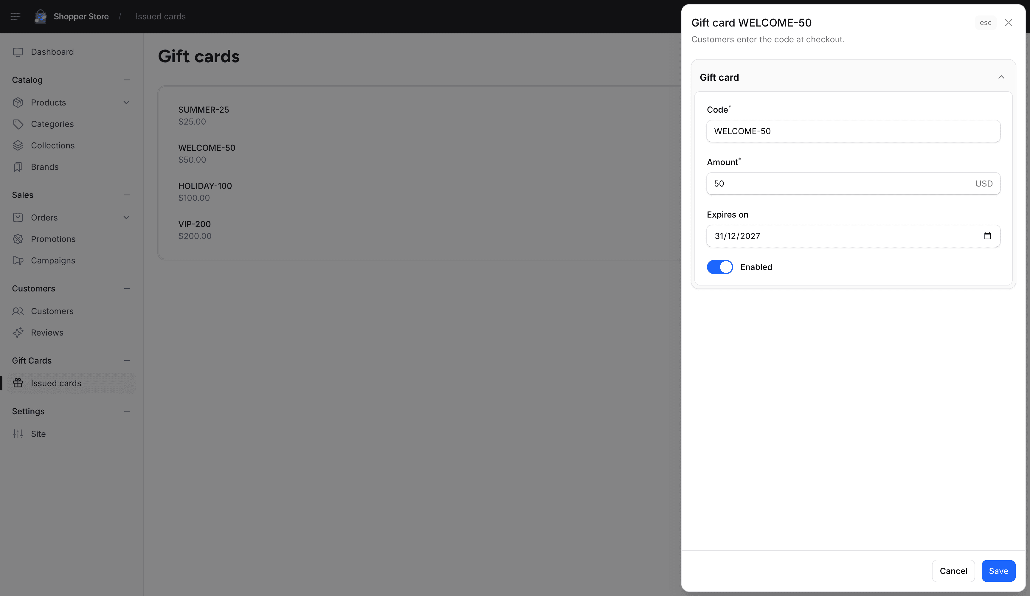
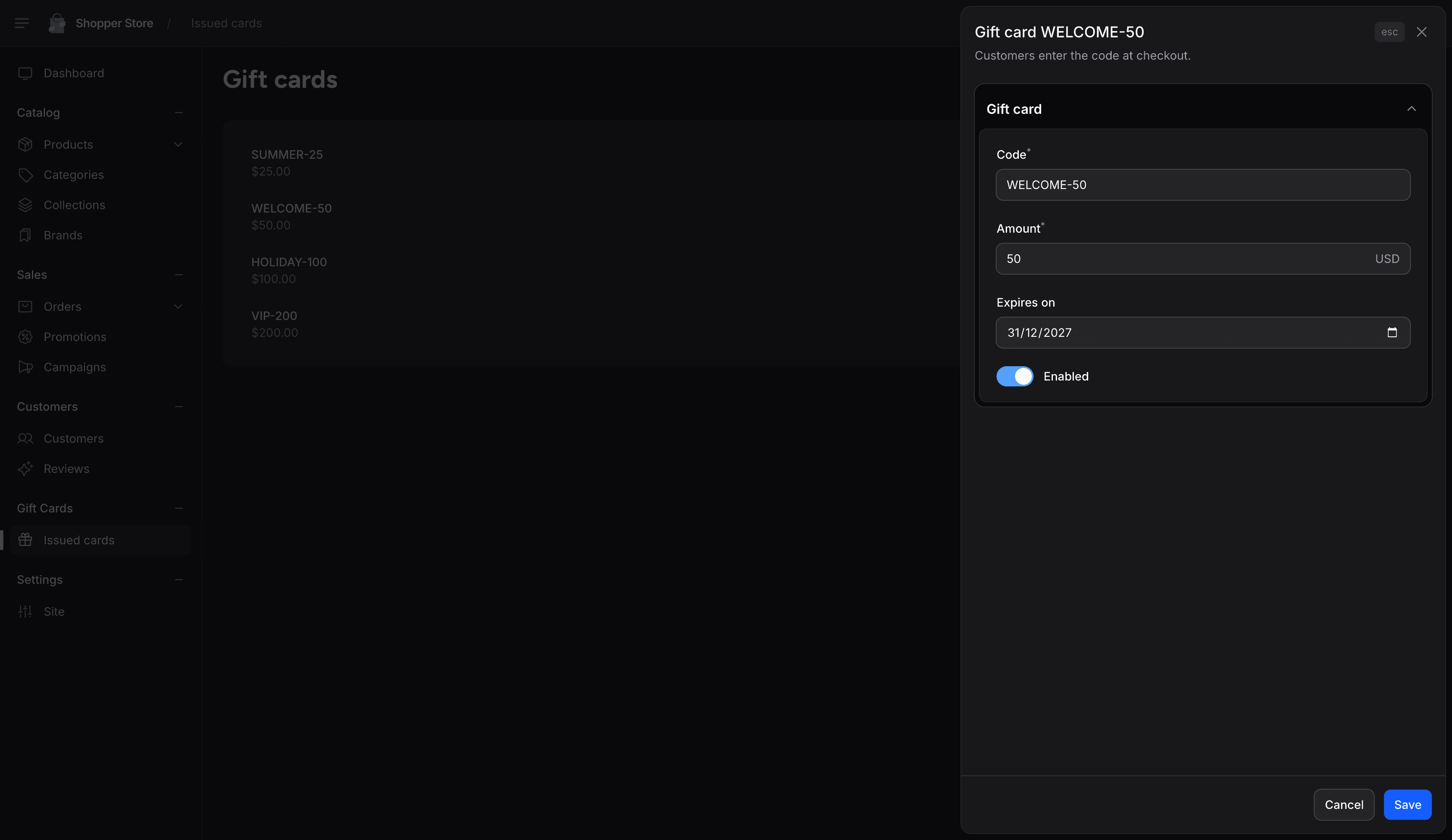
The component renders the title and a close button at the top, the description below them, the form in a body that scrolls, and a footer with a Cancel button that closes the panel and a Save button that submits the form to the action. To show more than the form, such as the balance left on a gift card, add a render() method to your class and return a view of your own that uses the same component.
| Prop | Default | Description |
|---|---|---|
x-shopper::form-slider-overbuilt on the <x-shopper::slideover-card> component | ||
actionstring | required | The Livewire method called when the form is submitted. The Save button shows a loader while it runs. |
titlestring | required | The heading of the panel. |
descriptionstring | null | Text shown below the heading. Nothing is rendered when it is empty. |
A panel without a form, such as the one that reorders categories, uses x-shopper::slideover-card directly and writes its own header and footer: the card gives the background, border and rounded corners of the panels.
Registering a Slide-over
A panel of your application needs no registration. Livewire finds it from its name, the path of the class below App\Livewire in kebab case: App\Livewire\SlideOvers\GiftCardForm is slide-overs.gift-card-form.
An add-on registers its panels with addonLivewireComponents(), which prefixes their names with shopper-, as described in Livewire Components.
Opening a Slide-over
A button opens a panel by dispatching the openPanel event with the name of the component. The arguments key passes values to the component:
<x-filament::button wire:click="$dispatch('openPanel', { component: 'slide-overs.gift-card-form' })">
    {{ __('Issue a gift card') }}
</x-filament::button>

<x-filament::button
    color="gray"
    wire:click="$dispatch('openPanel', { component: 'slide-overs.gift-card-form', arguments: { giftCard: {{ $giftCard->id }} } })"
>
    {{ __('Edit') }}
</x-filament::button>
Clicking Edit on a gift card opens the panel with the gift card loaded:
From PHP, such as the action of a table row, pass the name and the arguments to dispatch():
use App\Models\GiftCard;
use Filament\Actions\Action;

Action::make('edit')
    ->authorize('gift-cards.edit')
    ->action(fn (GiftCard $record) => $this->dispatch(
        'openPanel',
        'slide-overs.gift-card-form',
        ['giftCard' => $record->id],
    ));
The panel passes on the arguments named after a public property or a parameter of mount(), and drops the others. A name in kebab case, such as gift-card, matches the giftCard property. When the property is typed with a model, the argument is the key of the record: the panel loads it with resolveRouteBinding() and throws a ModelNotFoundException when it does not exist. A property typed with a backed enum takes the value of a case.
A panel opened from another panel stacks on top of it. Closing the top panel shows the previous one again.
Closing a Slide-over
The user closes a panel with the Cancel button or the close button of x-shopper::form-slider-over, the Escape key, or a click outside the panel. Your component closes it from PHP with these methods:
| Method | Effect |
|---|---|
closePanel() | Closes the active panel and shows the previous one, if the panel was opened from another panel. |
forceClose() | Chained before closePanel(), closes every open panel. |
skipPreviousPanels(int $count = 1, bool $destroy = false) | Chained before closePanel(), also closes that number of previous panels. With $destroy, their components are removed. |
closePanelWithEvents(array $events) | Dispatches the events, then closes the panel. A key that is a component name sends the event to that component only, and an array value is the event name followed by its parameters. |
GiftCardForm dispatches gift-card.saved before it closes. The page that lists the gift cards listens to it to render again, with the new card:
use Illuminate\Contracts\View\View;
use Livewire\Attributes\On;

#[On('gift-card.saved')]
public function render(): View
{
    return view('livewire.shopper.gift-cards.index');
}
Panel Options
Static methods of SlideOverComponent set the behavior of a panel. Override them in your component:
public static function panelMaxWidth(): string
{
    return '2xl';
}| Method | Default | Effect |
|---|---|---|
panelMaxWidth() | 'xl' | The maximum width of the panel: md, lg, xl, 2xl, 3xl, 4xl, 5xl, 6xl or 7xl. The attribute form of Shopper uses lg, the shipment details use 2xl and the shipping label form 5xl. |
closePanelOnClickAway() | true | Closes every open panel on a click outside them. |
closePanelOnEscape() | true | Closes the active panel on the Escape key. |
dispatchCloseEvent() | false | Dispatches a panelClosed event with the name of the component when the panel closes. |
destroyOnClose() | false | Removes the component when the panel closes, so the next opening mounts it again. |
The defaults come from the component_defaults key of config/livewire-slide-over.php. To change them for every panel, Shopper's included, publish the file with php artisan vendor:publish --tag=livewire-slide-over-config.
The panelAttributes key of the openPanel event overrides these options for one opening. Its keys are maxWidthClass (a Tailwind CSS class such as max-w-3xl), closeOnClickAway, closeOnEscape, dispatchCloseEvent and destroyOnClose:
<x-filament::button
    wire:click="$dispatch('openPanel', { component: 'slide-overs.gift-card-form', panelAttributes: { maxWidthClass: 'max-w-3xl', closeOnClickAway: false } })"
>
    {{ __('Issue a gift card') }}
</x-filament::button>
To change the width of a panel while it is open, such as when a step shows a wide table, call $this->resizePanel('max-w-5xl') from the component. The stylesheet of the admin panel holds the classes from max-w-md to max-w-7xl.
Last updated on
Edit on GitHub