
Navigation
Customize and extend the Shopper control panel navigation
The Control Panel navigation is highly customizable. You can add your own groups, items, and sub-items to it.
The navigation is controlled by the shopper/sidebar package. This package can be used both as a standalone sidebar builder for any Laravel application or to extend Shopper's admin panel.
Quick Start
To add navigation items to Shopper, create a sidebar extension class. Its extendWith() method receives the menu, adds a group to it, and adds an entry to the group for each of your pages:
namespace App\Sidebar;

use Shopper\Sidebar\AbstractAdminSidebar;
use Shopper\Sidebar\Contracts\Builder\Group;
use Shopper\Sidebar\Contracts\Builder\Item;
use Shopper\Sidebar\Contracts\Builder\Menu;

class GiftCardSidebar extends AbstractAdminSidebar
{
    public function extendWith(Menu $menu): Menu
    {
        $menu->group(__('Gift Cards'), function (Group $group): void {
            $group->weight(5);
            $group->collapsible();

            $group->item(__('Issued cards'), function (Item $item): void {
                $item->weight(1);
                $item->setAuthorized($this->user->can('gift-cards.browse'));
                $item->useSpa();
                $item->route('shopper.gift-cards.index');
                $item->setIcon('phosphor-gift');
            });
        });

        return $menu;
    }
}
$this->user is the signed-in admin user, so setAuthorized() hides the entry from users who do not hold the permission. The route is the one your custom route file names gift-cards.index.
Register the class as a listener of the SidebarBuilder event in your AppServiceProvider:
namespace App\Providers;

use App\Sidebar\GiftCardSidebar;
use Illuminate\Support\ServiceProvider;
use Shopper\Sidebar\SidebarBuilder;

class AppServiceProvider extends ServiceProvider
{
    public function register(): void
    {
        $this->app['events']->listen(SidebarBuilder::class, GiftCardSidebar::class);
    }
}
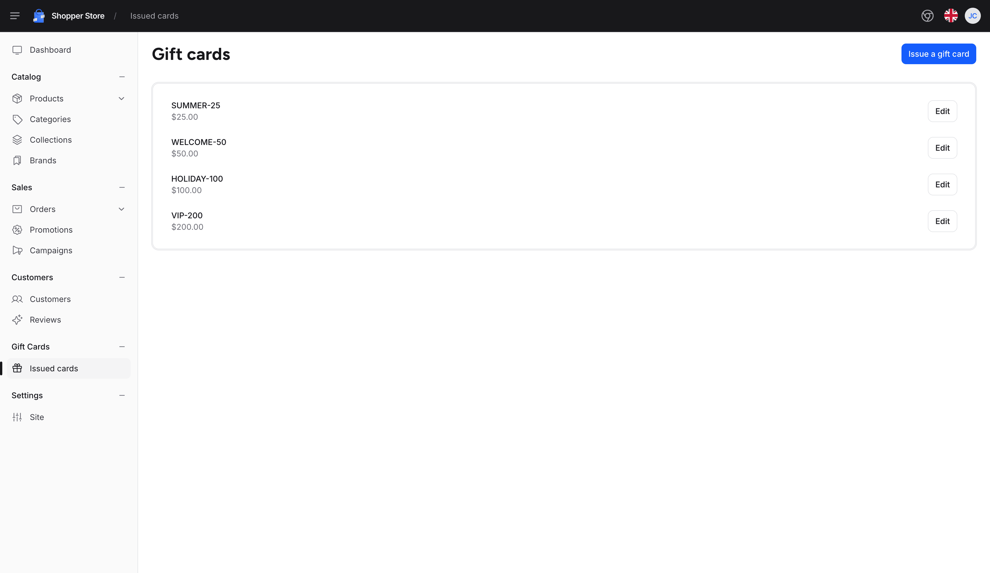
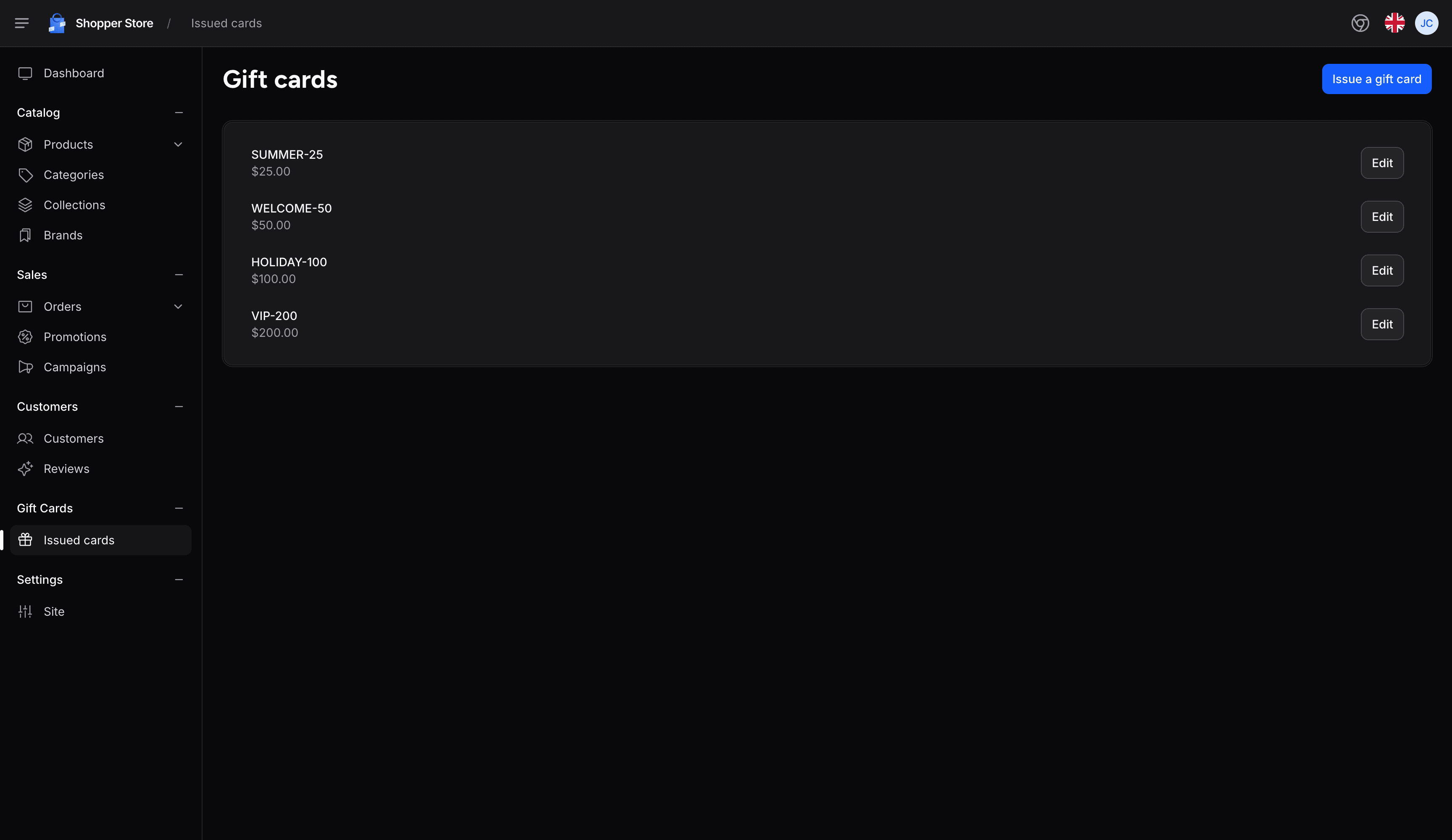
The Gift Cards group then shows in the sidebar, and its Issued cards entry is selected on the page it links to:
Shopper registers its own sidebar listeners in the register() method of a service provider. The sidebar is built later, while the admin request runs, so a listener registered in boot() works too.
API Reference
The sidebar is built from five objects. The methods below are the ones a sidebar extension calls most; the linked sections describe each one:
| Component | Methods | Documentation |
|---|---|---|
| Menu | group() returns the group of that name, created on the first call, and runs the closure on it | Group API |
| Group | weight(), hideHeading(), collapsible(), setAuthorized(), item(), and the CSS class setters setClass(), setHeadingClass() and setGroupItemsClass() | Group API |
| Item | route(), setUrl(), isNewTab(), setIcon(), useSpa(), weight(), setAuthorized(), isActiveWhen(), toggleIcon(), toggleActiveIcon(), setItemClass(), setActiveClass(), setParentItemClass(), badge(), append() and item() for a sub-item | Menu Item API |
| Badge | setValue(), setClass() and color() | Adding Badges |
| Append | setName(), route(), setUrl(), setIcon(), setClass() and setAuthorized() | Adding Append Elements |
A few of these methods change how an entry or a group behaves in the admin panel:
| Method | Behavior |
|---|---|
Group::hideHeading(bool $hide = true) | Hides the heading of the group. A group with an empty name has no heading either. |
Group::collapsible(bool $collapsible = true) | Turns the heading into a button that folds the entries. The browser remembers the folded groups. |
Item::isActiveWhen(string $path) | Marks the entry active for a path pattern instead of its own URL, such as config('shopper.admin.prefix').'/gift-cards*'. The pattern includes the admin prefix, its leading and trailing slashes are removed, and * matches any characters. |
Item::getActiveWhen(): ?string | Returns the pattern, or null when the entry has none. A custom item view reads it to mark the active entry. |
Item::toggleIcon(string $icon, string $type = 'blade', string $iconClass = '') | Replaces the chevron shown after the label of an entry that has sub-items. toggleActiveIcon() takes the same arguments for the chevron of the open entry. |
Item::setParentItemClass(string $class) | Adds a CSS class to the list element that wraps the entry, where setItemClass() styles the link itself. |
Badge::color(string $color) | Adds the sh-sidebar-item-badge-{color} class to the badge. The admin panel styles primary, success, warning, danger, info and purple. |
Shopper places its own groups with weights from 1 to 10, as described in Weight System.
Last updated on
Edit on GitHub